
ichi3270です。
以前、HTML / CSS / JSでシンプルなゲージを作る記事を書きました。
需要はほとんど無いのですが、自分としては、結構楽しかったです。
今回は、もうちょっと複雑な物をつくってみよう・・・ということで、ストリートファイターⅤ風のライフゲージを作ってみました。
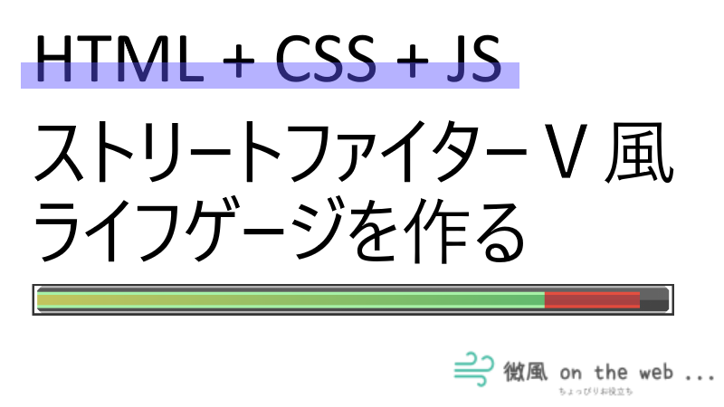
完成したゲージ
ストリートファイターⅤ風 ライフゲージ
*攻撃ボタン、毒ボタンも動作するので、是非押してみてください。
ソースコード
かなり雑で申し訳ないのですが・・・誰かの参考になれば幸いです。
HTML
<div id="gauge-container">
    <div id="background">
        <div id="background-top"></div>
        <div id="background-bottom"></div>
        <div id="back-gauge" class="full"></div>
        <div id="front-gauge" class="full"></div>
        <div id="frame">
            <div id="triangle-tl"></div>
            <div id="triangle-tr"></div>
            <div id="triangle-bl"></div>
            <div id="triangle-br"></div>
        </div>
    </div>
</div>
<div id="btns">
    <button onclick="attack(5)">攻撃</button>
    <button onclick="poison()">毒</button>
</div>
CSS
#gauge-container * {
    box-sizing: border-box;
}

#gauge-container {
    width: 100%;
    height: 30px;
    background: black;
    display: flex;
    justify-content: center;
    align-items: center;
}

#background {
    position: relative;
    z-index: 0;
    width: calc(100% - 4px);
    height: calc(100% - 4px);
    display: flex;
    align-items: center;
}

#background-top,#background-bottom {
    position: absolute;
    z-index: 1;
    width: 100%;
    height: 50%;
}

#background-top {
    top: 0%;
    background: linear-gradient(to right,rgb(45,45,45),rgb(60,60,60));
}

#background-bottom {
    bottom: 0%;
    background: linear-gradient(to right,rgb(35,35,35),rgb(20,20,20));
}

#back-gauge,#front-gauge {
    position: absolute;
    z-index: 2;
    width: 100%;
    height: 60%;
}

#back-gauge {
    background: rgb(160, 15, 15);
    border-top: solid rgb(240, 30, 10) 3px;
    border-bottom: solid rgb(240, 30, 10) 3px;
    opacity: 0;
}

#back-gauge.full {
    background: repeating-linear-gradient(45deg, rgb(200, 160, 70) 0%, rgb(250, 250, 180) 10%, rgb(200, 160, 70) 35%);
    border-color: rgb(220, 220, 120);
    opacity: 1;
}

.fadeout {
    animation: fadeOut 2s forwards;
}

@keyframes fadeOut {
    0% { opacity: 0.9 }
    50% { opacity: 0.9 }
    100% { opacity: 0 }
}

#front-gauge {
    border-style: solid;
    border-width: 3px 0;
}

#front-gauge.full {
    background: linear-gradient(45deg, transparent 0% 5%, rgb(255, 255, 200) 7% 9%, transparent 11% 12%, rgb(255, 255, 200) 14%, transparent 16% );
    background-size: 200% 200%;
    border: none;
    animation: flow 5s infinite ease;
}

@keyframes flow {
    0% {
        opacity: 0;
        background-position: -60%;
    }
    40% {
        background-position: -60%;
        opacity: 1;
    }
    80% {
        background-position: -10%;
        opacity: 0.4;
    }
    100% {
        background-position: -10%;
        opacity: 0;
    }
}

.normal {
    background: linear-gradient(to left, rgba(36, 206, 87, 0.8), rgba(189, 224, 61, 0.8));
    border-color: lightgreen;
}

.poisoned {
    animation: poisoned 1s infinite alternate ease-out;
}

@keyframes poisoned {
    0% {
        background-color: rgb(80,40,140);
        border-top: solid rgb(100,60,160);
        border-bottom: solid rgb(100,60,160);
    }
    100% {
        background-color: rgb(200,170,230);
        border-top: solid rgb(220,190,250);
        border-bottom: solid rgb(220,190,250);
    }
}

#frame {
    position: absolute;
    z-index: 3;
    width: 100%;
    height: 100%;
    border-top: solid 2px darkgray;
    border-bottom: solid 2px darkgray;
    border-left: solid 3px white;
    border-right: solid 3px white;
}

#triangle-tl {
    position: absolute;
    top: -2px;
    left: -3px;
    width: 0;
    height: 0;
    border-top: 7px solid white;
    border-right: 7px solid transparent;
}

#triangle-tr {
    position: absolute;
    top: -2px;
    right: -3px;
    width: 0;
    height: 0;
    border-top: 7px solid white;
    border-left: 7px solid transparent;
}

#triangle-bl {
    position: absolute;
    bottom: -2px;
    left: -3px;
    width: 0;
    height: 0;
    border-bottom: 7px solid white;
    border-right: 7px solid transparent;
}

#triangle-br {
    position: absolute;
    bottom: -2px;
    right: -3px;
    width: 0;
    height: 0;
    border-bottom: 7px solid white;
    border-left: 7px solid transparent;
}

#btns {
    display: flex;
    justify-content: left;
    margin-top: 10px;
}
#btns button {
    width: 5em;
    margin-right: 1em;
}
JavaScript
const frontGauge = document.getElementById("front-gauge");
const backGauge = document.getElementById("back-gauge");
const comboLimit = 1000;
let life = 100;
let backGaugeIsAnimation = false;
let gaugeMode = "full";
let damagedTime  = new Date().getTime();

// fadeoutアニメーション開始時
backGauge.addEventListener("animationstart", () => {
    backGaugeIsAnimation = true;
});

// fadeoutアニメーション終了時
backGauge.addEventListener("animationend", () => {
    backGauge.style.width = life + "%";
    backGauge.classList.remove("fadeout");
    backGaugeIsAnimation = false;
});

// *** 攻撃ボタン *** //
function attack(damage){
    // ゲージ状態更新
    if ( gaugeMode === "full" ){
        frontGauge.classList.remove("full");
        backGauge.classList.remove("full");
        frontGauge.classList.add("normal");
        gaugeMode = "normal";
    }
    // コンボ判定
    const currentTime = new Date().getTime();
    if ( currentTime - damagedTime > comboLimit ){
        backGauge.style.width = life + "%";
    }
    // ダメージ処理
    life < damage ? life = 0 : life -= damage;
    frontGauge.style.width = life + "%";
    damagedTime = new Date().getTime();
    // 進行中のfadeoutアニメーションを終了
    if ( backGaugeIsAnimation ){
        backGauge.classList.remove("fadeout");
        void backGauge.offsetWidth;
    }
    // fadeoutアニメーション開始
    backGauge.classList.add("fadeout");
}

// *** 毒ボタン *** //
function poison(){
    // ゲージ状態更新
    if (gaugeMode === "full"){
        frontGauge.classList.remove("full");
        backGauge.classList.remove("full");
    } else if ( gaugeMode === "normal" ){
        frontGauge.classList.remove("normal");
    }
    gaugeMode = "poison";
    frontGauge.classList.add("poisoned");
    // ライフ減少
    const intervalId = setInterval(() => {
        life < 0.1 ? life = 0 : life -= 0.1;
        frontGauge.style.width = life + "%";
    }, 100);
    // 毒状態解除
    setTimeout(() => {
        clearInterval(intervalId);
        frontGauge.classList.remove("poisoned");
        frontGauge.classList.add("normal");
        gaugeMode = "normal";
    }, 10000);
まとめ
今回は、あまり経験がなかったグラデーションやアニメーションにチャレンジできました。ノーダメージ状態(金色)時のアニメーションなんかは結構苦労しました・・・が、正直あまり理解できておらず。
それ以上に、特に・・・
void backGauge.offsetWidth;
これが理解できない・・・のですが、実行中のアニメーションを強制的に止めて、最初から再実行するためにはこれが必要なようです・・・。
コメント